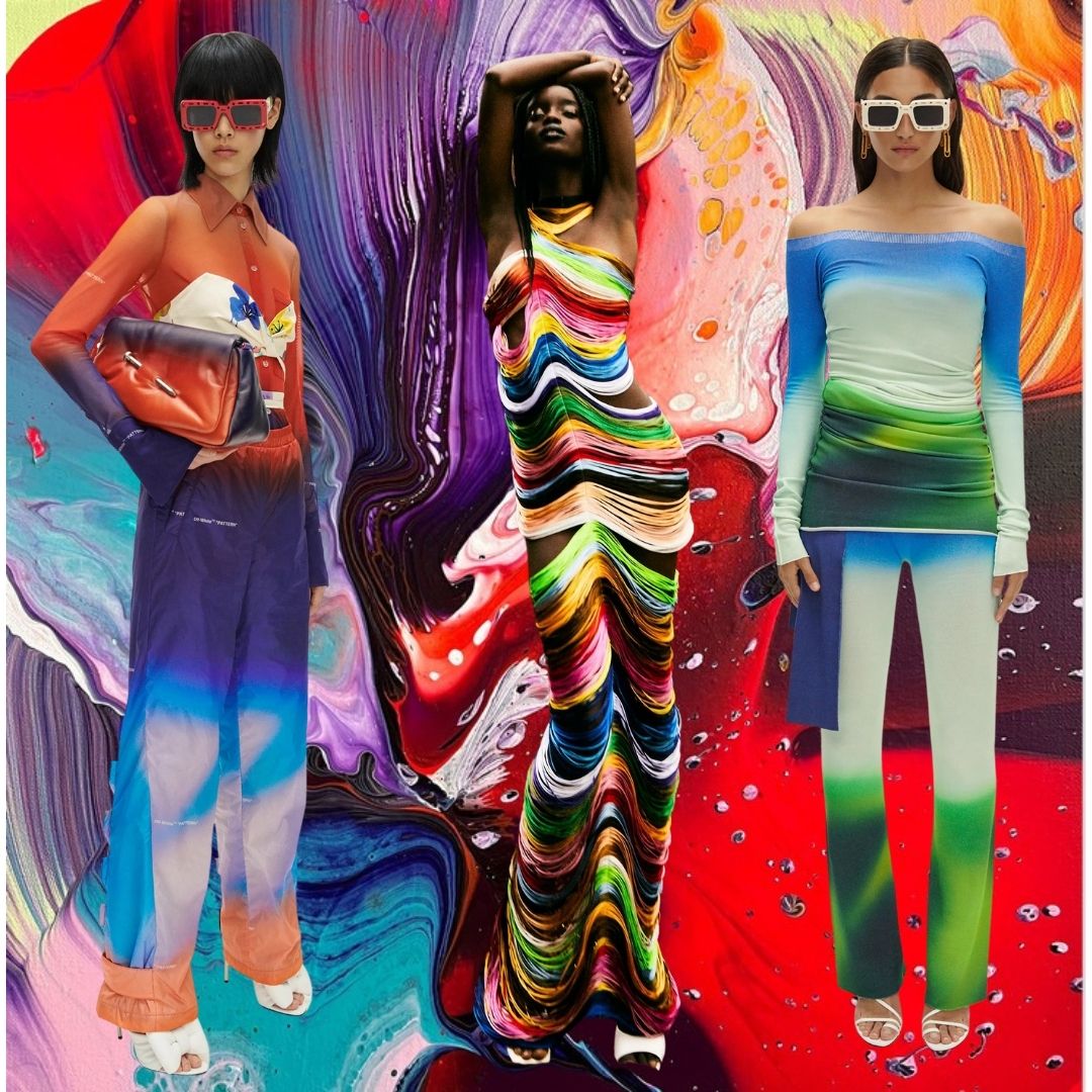
Contemporary art is an omnipresent and indispensable source of inspiration for every fashion designer. That’s why fashion and especially colour trends are always matching artworks. For example, who doesn’t remember the lobster dress by Elsa Schiaparelli in 1937, inspired by the work of Salvador Dali? Or the iconic Yves Saint Laurent dress based on the lines of artist Piet Mondrian. So to help us make this article worth bookmarking, we asked the advice of Artsper, Europe’s leading online marketplace for contemporary art, to share with us the current colour trends and patterns in the art world.
This year, fashion colour trends are state of the art.
Many fashion designers opted for colours and designs that represent joy, life, celebration and rebirth after the pandemic. The visualisation of this trend is strong and contrasting colours, like Very Peri, the Pantone colour of the year. For example, French luxury brand Valentino showed a couture collection with pink, yellow, red, and green colours in its gowns. And with this trend, fashion is clearly celebrating the Art of Living after two years of austerity.
On the other hand, many brands preferred to welcome the return to life with style and colours which represent nature, sustainability, more conscious life and away from over-consumption. The visualisation of this trend is sandy beige, terracotta colours, shades of brown, pastel blue, and forest green hues. The fashion designer that best incorporated this trend is Gabriela Hearst, for the luxury brand Chloé. By the way, we call this colour trend the Art of Appreciation.
Art that inspires the Art of Living colour trend
Let’s see all the bright colours trend matching artworks:
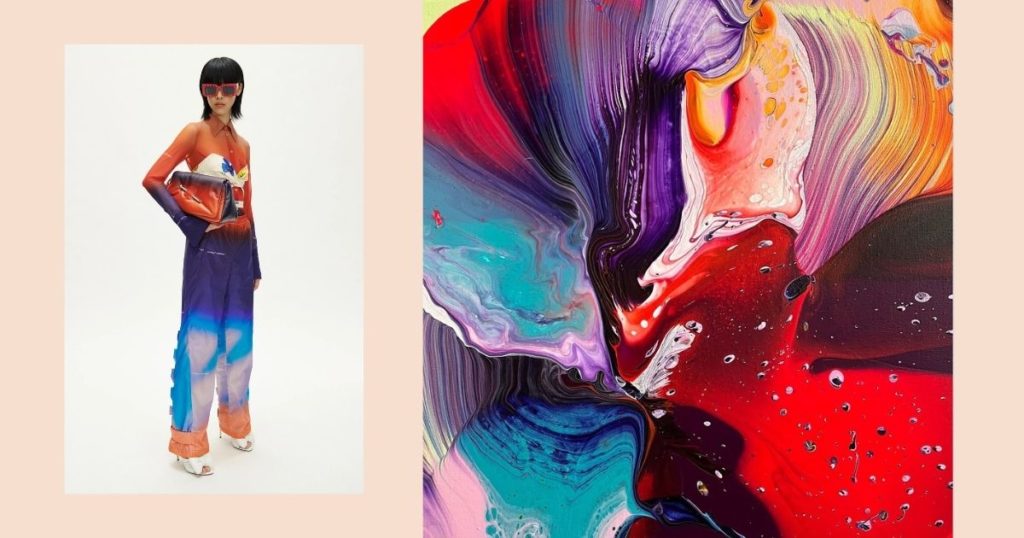
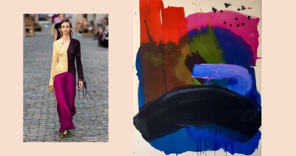
- 1- The painting “That’s Enough” by artist Nikolaos Schizas shows an explosion of colour and movement, 100% in line with the Art of Living trend. And the Off-White look is a great example of combining red, white and purple and blue degradée.
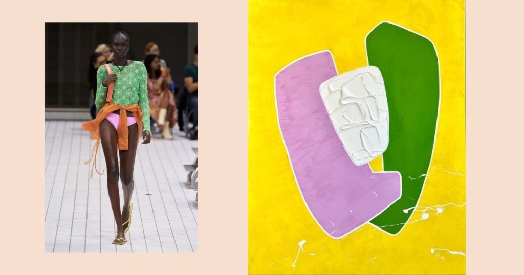
- 2- “Feel Good” is the work of French artist Aude Herlédan. Indeed, the combination of pink, green and yellow is pure joy. And this is the colour combination we see in Rejina Pyo’s latest collection.
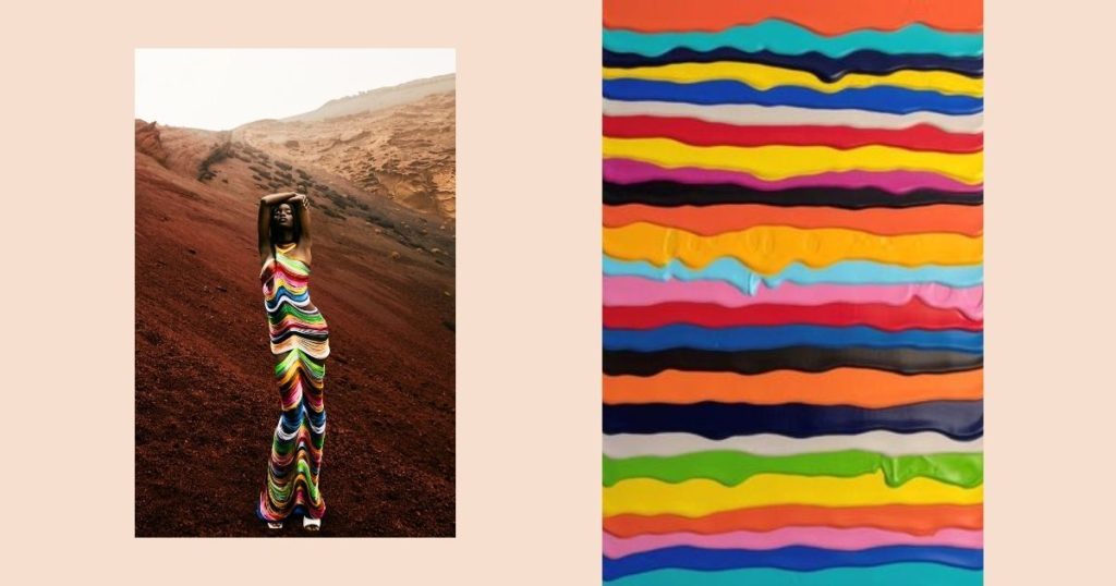
- 3- Irish artist Derick Smith created “For Joy”, a sensual image of coloured lines, which we found in several collections this year. Yes, the stripes got more colours than the classic blue and white, as seen in this fantastic dress from The Attico.
- 4- Tory Burch’s outfit with beige, aubergine, purple and green looks like it came straight out of a painting “Le Pays des Sources” by French artist Gauthier Bruel. And these colours will be a trend both next summer and winter.
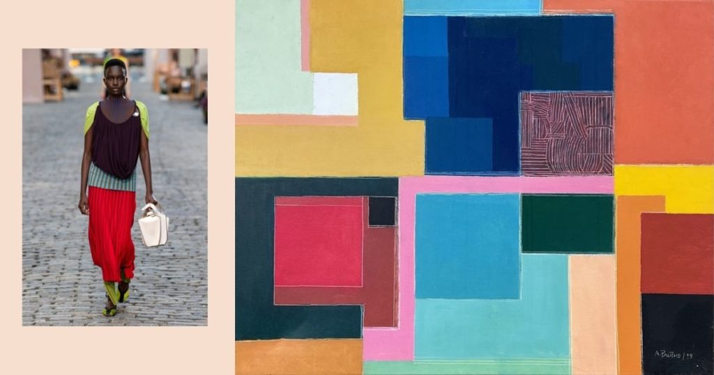
- 5- Antoine Pauthe’s cubic “Composition xlv-179, Serie Abstraction” inspires endless colour combinations, which you surely already have in your wardrobe. And we found something similar to Pauthe’s work in Tory Burch’s look; a chic layering of a red skirt, green legging, blue top and brown and green cape- blouse.
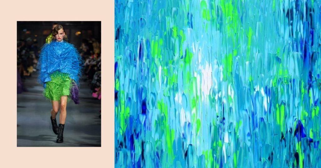
- 6- The Art of Living colour trend is all about the energy of colours, as shown in this Valentino look. And the artwork that best inspires the different nuances of this combination of green and blue is the painting “Relief Blue 2” by artist Tiberui Soos.
Art that inspires the colour trend Art of Appreciation
Let’s see all the earthly and pastel colours trend matching artworks:
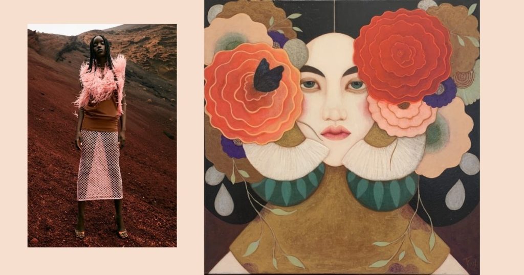
- 1- Millenial pink that appeared in 2016 remains a strong trend but should now be combined with beiges, greys, browns and forest greens, like the pastel shades in the elegant “Jardin Secret” painting by Faixa Maghni and The Attico’s outfit.
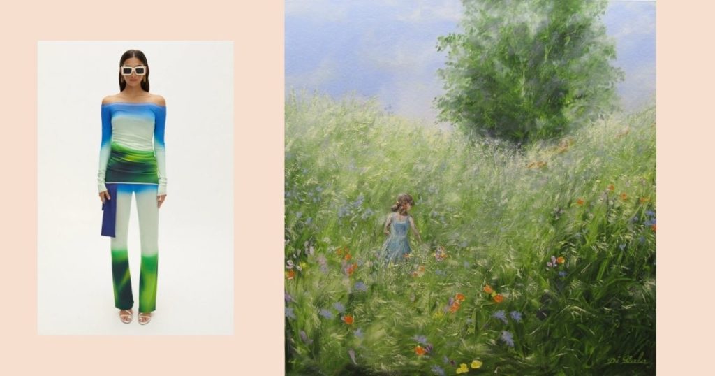
- 2- The Art of Appreciation colour trend is linked back to nature, like this classic bucolic landscape “Les Rubans Rouges” by Brigitte di Scala and the Off-White look. So bet on the combination of sky blue and grass green.
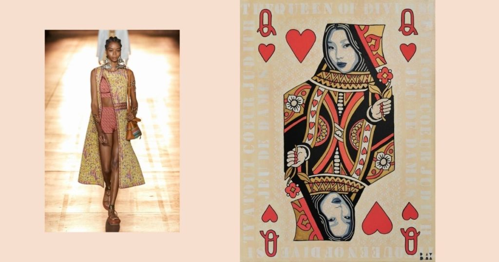
- 3- Not only are beige, terracotta, and brown colours in the Art of Appreciation trend, but also the folkloric pattern of several cultures. And the Italian brand Etro translates this trend very well, as well as the work by artist B.AX “Queen of Diversity”.
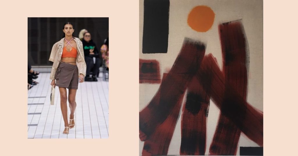
- 4- “Crazy Trees” by Gauthier Bruel brings a combination of brown, beige and orange. As you can see, this is the same colour palette in Rejina Pyo’s outfit. Indeed, art and fashion go hand in hand.
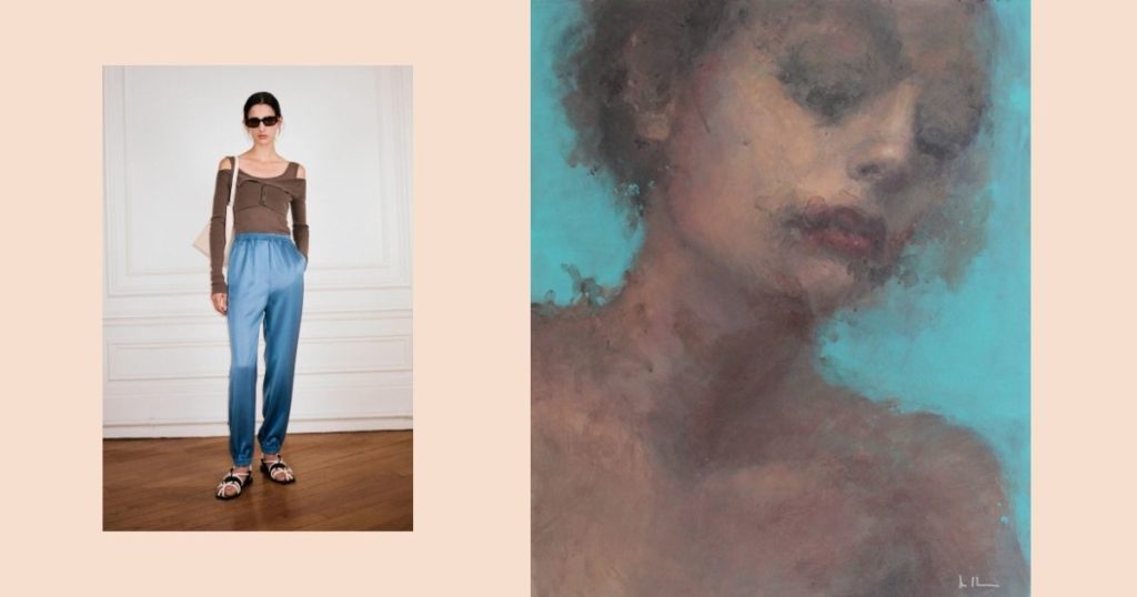
5- The trend of blue and brown colours will be present all year round, as proposed by the look of the sustainable brand Nanushka. And just like the portrait “Cool” by artist Helen Halfermeyer, who works with classic colour nuances but with a modern stroke.
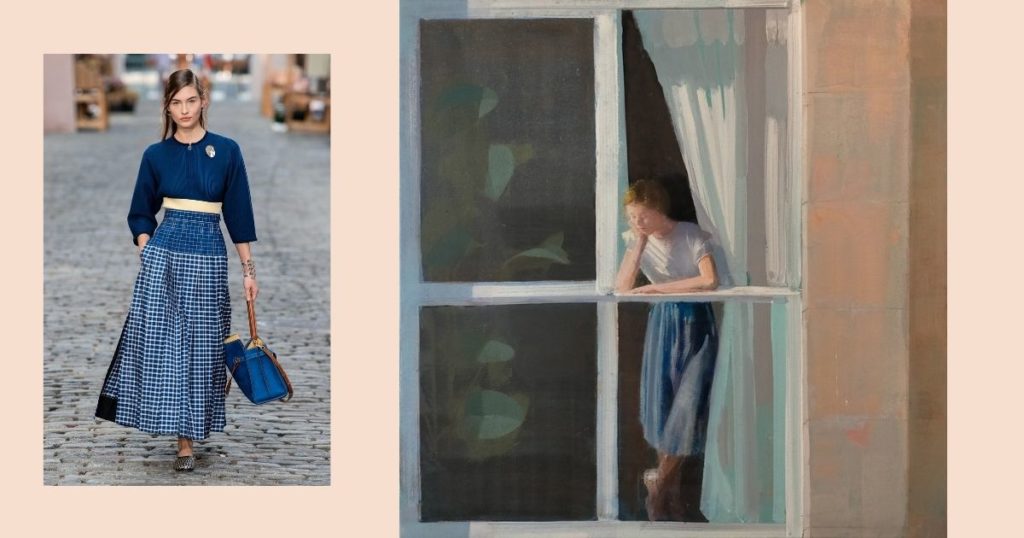
6- The girl in the window of the painting “Al Sol”, by Spanish artist Alejandra Caballero, could be the model for Tory Burch’s runway. The two figures remind us of country life with a wide skirt and shades of navy blue and white—a simple and chic look in the wardrobe and hanging on the wall.
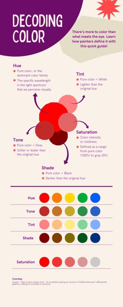
Last but not least, here is some extra information for you to master the art of colours.
If you fell in love with any of the artworks shown above, Artsper gives you up to 14 days to try it out in your home environment. And if you change your mind, you can send it back at no extra cost.
